Design guidelines
Logo
Download LogosSymbol
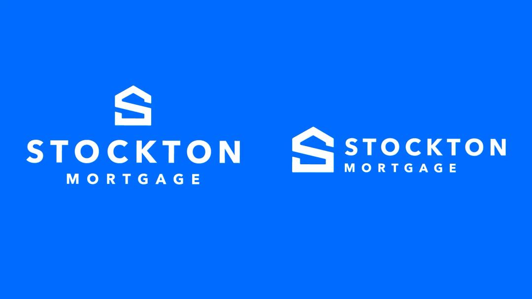
Our symbol is an S monogram in the shape of a house. It’s used to consistently identify Stockton Mortgage in communications.

Lockups
We have two logo lockups. Use one in center-aligned applications and use the other for left-aligned applications. Make sure to use the correct lockup for your application.
Logo animation
This is our standard logo animation. It can be used at the beginning or end of a video as a sign off.
Symbol clearspace
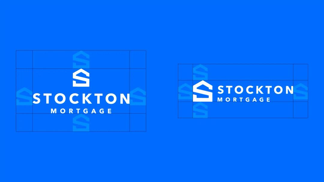
Clearspace is the minimum space allowed between the logo and other visual elements. The clearspace is always equal to the size of the symbol in all directions.

Lockup clearspace
Clearspace is the minimum space allowed between the logo and other visual elements. The clearspace for our lockup is always equal to the size of the symbol in all directions.
Logo placement - center-aligned
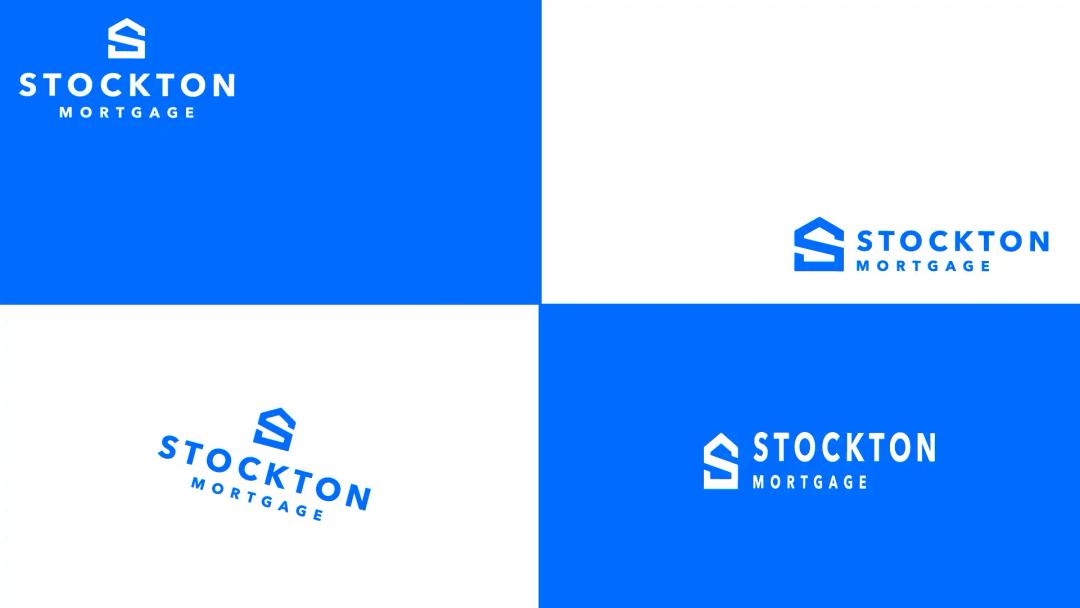
Only place the center-aligned lockup in one of three positions: Top-center, center-center, or bottom-center. This lockup should never be left- or right-aligned or used in a corner.

Logo placement - left-aligned
Only place the left-aligned lockup in one of these two positions: Top-left or bottom-left. The left-aligned lockup should never be center-aligned.

Misuse
Don’t put the center-aligned logo in a corner
Don’t right align the left-aligned logo
Don’t rotate the logo
Don’t stretch or skew the logo
Don’t remove elements of the logo
Don’t recolor parts of the logo
Don’t add elements to the logo
Don’t outline the logo
Don’t remove pieces of the logo
Don’t add drop shadows to the logo
DBA logos
Similar to the Stockton logo, DBA logos should be one color.

Typography
We’re using the Mabry Pro font family. It’s friendly, approachable, and clear.
 Download Fonts
 Hierarchy
We’re using a modular scale based on the golden ratio, rounded to the nearest whole number, to determine type hierarchy. The size of body copy serves as the base to determine the size of styles. This allows us to keep a consistent ratio between styles at varying sizes.
Visit modularscale.com to generate new numbers.

Type color
To ensure legibility and contrast, typography should only ever be white, navy, or blue. This graphic shows acceptable color applications.

Alignment
Type should only ever follow one alignment per composition. It should either be ALL left-aligned or ALL center-aligned. It should never be right-aligned.

Misuse
Do not mix and match alignments.

Color
Blue and navy are our primary brand colors. We have a secondary pastel palette that feels bright and fresh, giving us flexibility in digital applications.
 Download Color Swatches
 Graphic language
Our brand uses a variety of graphic elements to support type and imagery. They’re all derived from the foundational house shape in our logo.
Composition
The base house shape can be scaled and rotated inside a composition to create versatile and interesting layouts.
Masking
When masking photos into compositions, remember: we put customers in houses. Stockton employees always go behind houses. Stockton customers always go in houses.

Sample compositions
This is a collection of compositions that show how the foundational house shape can be used to create layouts.
 Download Composition Samples
 Neighborhood pattern
This pattern uses our foundational house shape to build a neighborhood. The patterns references our experience,. It's a visual representation of the repetitions we’ve put in.
Color usage
It can be used in various colorways. It should always be three colors.

Example usage
Here are two examples of how you can use the neighborhood pattern.


Equity pattern
This pattern represents the appreciating equity of homeownership. It's created by blending between two foundational houses.
Color options
This is a collection of color options. But these are not the only options. We encourage you to explore color and blends that work for your application.
Example usage


Photography
Our photography should feel like a narrative. We want to tell the story of working with Stockton and our Loan Officers. Use natural light to illuminate our subject and enhance the mood, tone, and atmosphere of the scene. Whether you’re capturing a candid moment of someone at work or a relaxed portrait, the images should convey the warmth of our brand.
Detailed Photography NotesEmployees

Homeowners

Design examples


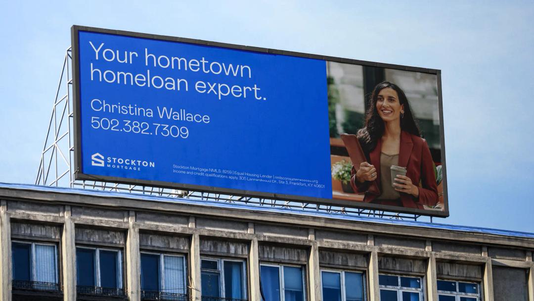

Templates
Employee Contact Info
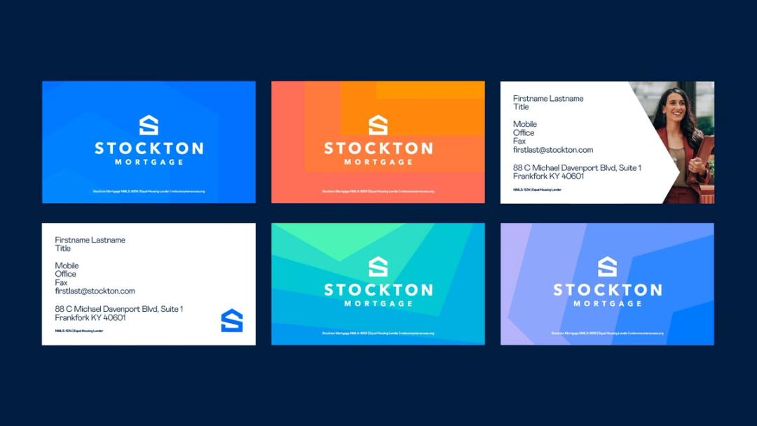
This is the standard layout for contact information. It follows a three column grid and uses our typography rules.
 Download Template
 This shows examples of how to handle a variety of information.

Event promotion
Promotional materials should consider the audience. Prioritize the information they need, use clear and consistent hierarchy, and avoid decoration.
 Download Example